
To test mobile navigation for SEO, use a real phone to follow important paths from the homepage to categories, services, articles, and contact pages. Inspect the rendered HTML links, check whether touch and keyboard controls work, and confirm that mobile visitors can reach the same essential information as desktop visitors. Record failures, repair the underlying template, and rerun the exact journeys. The outcome is a documented, repeatable usability and crawlability audit, not a guaranteed ranking improvement.
Quick Answer
Test core mobile menu paths on a real phone, inspect rendered anchors and destinations, check keyboard access, and verify fixes using the same test sheet. A successful audit shows that important pages are reachable through clear links and reliable controls.
Key Takeaways
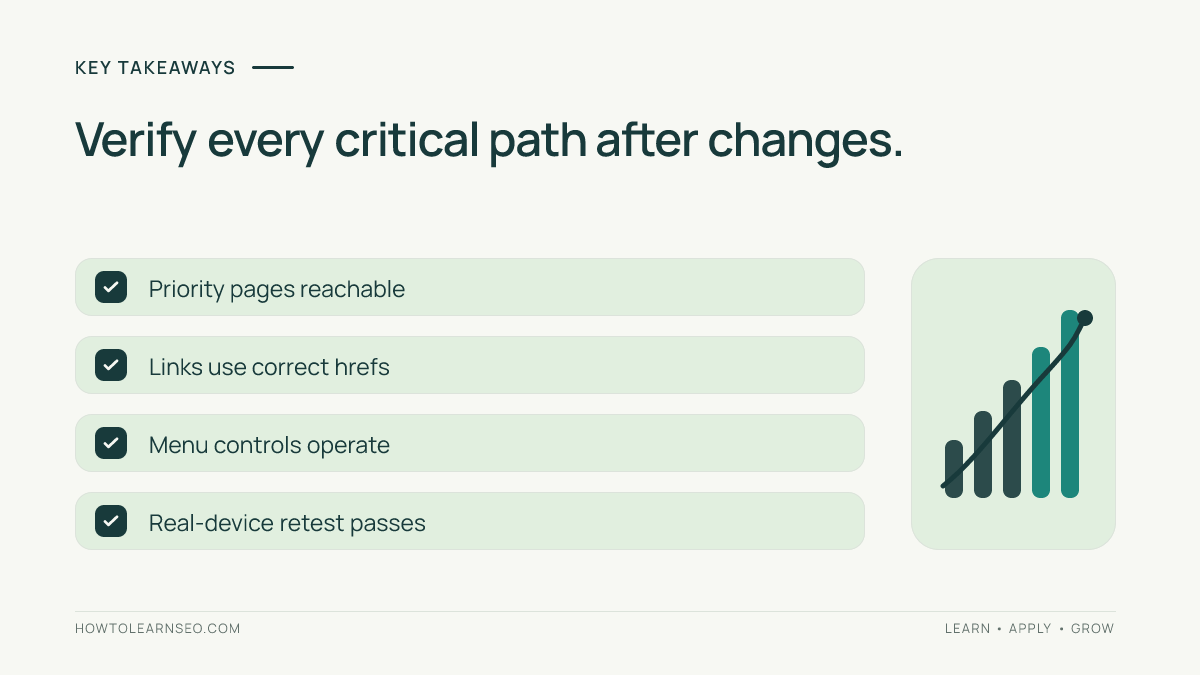
- Test complete user journeys, not just menu appearance.
- Inspect real href links and destination responses.
- Include touch, keyboard, and accessibility checks.
- Compare important mobile and desktop paths.
- Retest live templates after changes.
Why Mobile Navigation Matters
Visitors rely on navigation to understand what a website offers. Search crawlers also discover pages through internal links. A mobile menu that hides important sections or relies on unreliable controls can make useful content harder to find. A shorter mobile menu is not automatically bad: a compact hierarchy may be easier to use than a giant list. The important question is whether the visitor can reach the destination through a clear, working route.
Google’s mobile-first indexing guidance emphasizes the mobile version of website content. Its crawlable links documentation describes the value of ordinary HTML anchors. These sources support checking content access and link implementation; they do not establish that a particular menu arrangement automatically improves rankings.
Start with a clear map of your site’s major categories. The website architecture guide explains how hierarchy connects important pages. The mobile SEO fundamentals provide context for responsive templates. Use these resources to distinguish genuinely important destinations from pages that belong deeper in the site.
Prepare Your Mobile Navigation Audit
You need a real smartphone, a desktop browser with developer tools, and access to the public website. Ideally, also use a keyboard and a screen reader. Create a spreadsheet with starting page, target URL, device, viewport width, action sequence, expected result, observed result, severity, owner, and verification date. Avoid relying on a logged-in admin session: the public menu may be different.
Select a representative sample rather than every URL. Include the homepage, a category page, a product or article, and a service or location page. Choose priority destinations such as a top category, a detailed offering, a contact page, and a conversion path. If the website has separate regional menus, test at least one example per important region. If multiple themes or headers exist, test each distinct template.
Define success before starting. A passing journey should open the menu, expose a meaningful label, activate the intended link, load the correct page, and allow a visitor to return without becoming trapped. A passing technical check should show a sensible destination URL and a working response. This separation helps you identify whether the defect is visual, interactive, structural, or server-side.
Step 1: Test Real Touch Journeys
Open the homepage in portrait orientation. Find the menu button, tap it, expand each top-level group, and follow a priority link. Use the Back control and repeat with another destination. Try scrolling before opening the menu, then rotate the device and repeat. Check whether sticky headers, consent banners, or overlays cover links. Note whether the menu closes after navigation and whether the page becomes scrollable again.
Repeat the test at narrow and wide phone widths. Browser responsive mode is useful for debugging, but it cannot reproduce every touch problem. Use at least one real device. Look for small overlapping targets, submenus that collapse before selection, off-screen links, and fixed elements that intercept taps. A reproducible defect report should include the exact sequence, not merely say that the mobile menu is broken.
Try a slower connection or reload while the menu is open. Some menus depend on delayed JavaScript and briefly display incomplete destinations. Compare the experience on the homepage with a product or article template. A shared header can behave differently when page-specific scripts or styles are loaded. Preserve screenshots and steps so a developer can recreate the problem.
Step 2: Inspect Crawlable Navigation Links
Open developer tools and inspect the rendered navigation. Important destinations should generally be represented by anchors with href attributes, such as <a href="/services/">Services</a>. A button is appropriate for expanding a submenu, but a clickable div without a destination is not a reliable substitute for a navigation link. Check that each href points to the intended public URL.
JavaScript menus are not automatically uncrawlable. The relevant question is whether meaningful links appear in the rendered DOM and can be followed. Compare initial HTML, rendered output, and user interaction. The JavaScript SEO guide explains these differences. Do not assume that extracting a link proves it can be tapped: an invisible overlay may still block the user.
Test each destination for incorrect redirects, 404 responses, and unexpected locale changes. When a menu points to an obsolete redirect, consider linking directly to the final destination. For important URLs, check whether the mobile template omits a link that desktop visitors can use. A difference in presentation is fine; an accidental loss of access deserves investigation.
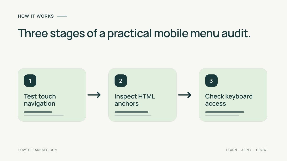
Step 3: Check Keyboard and Assistive Access
At mobile viewport width, press Tab to reach the menu control. Activate it, move through its links, and close it. Focus should be visible and follow a logical order. Collapsed submenu links should not unexpectedly receive focus. If an overlay opens, check whether keyboard users can leave it. Inspect the control’s accessible name and expanded state.
The W3C navigation menu tutorial explains semantic menu structures. Native links and buttons are often simpler than custom interaction roles. A screen reader should announce understandable labels rather than vague icon names. Test increased zoom and long labels because text can overflow narrow headers.
Accessibility and crawlability overlap but are not identical. A crawler may follow a link whose text is unclear to a visitor. A screen reader may announce a button that never reveals its submenu. Record each issue separately. Treat an inaccessible core navigation control as a serious usability defect even if a crawl report shows all destination URLs.
Worked Example: A Missing Service Link
Imagine a fictional plumbing company. Its desktop Services menu lists Emergency Repairs, Drain Cleaning, Boiler Service, and Locations. On mobile, only the first two links appear. Boiler Service remains live at /services/boiler-service/. This is a hypothetical example, not a claim about a tested website.
Input: open the homepage at a 390-pixel viewport and record the visible Services links. Rule: important service destinations should remain accessible through a usable mobile route, even when desktop and mobile layouts differ. Action: correct the shared menu data and add a standard anchor to the Boiler Service page. Expected result: the submenu exposes Boiler Service and tapping it opens the intended page.
Verification: repeat the journey on a phone, inspect the anchor href, check the destination response, and test keyboard focus. Edge case: if Boiler Service is no longer offered, do not restore an obsolete link simply to match desktop. Update the site’s actual service architecture instead. This example shows how a clear decision rule prevents mechanical changes that misrepresent the business.
Record the before-and-after path in the audit sheet. A passing result means the destination is reachable and its link works. It does not mean search rankings have improved. Keep any later traffic analysis separate from the implementation test, because numerous other factors influence organic visibility.
Step 4: Review Labels and Navigation Depth
Count the actions required to reach each priority page. A deeper menu is not necessarily harmful, but vague labels and unnecessary detours create confusion. Ask someone unfamiliar with the website where they would tap to find a specific service. If the answer repeatedly differs from the intended section, improve the label or grouping rather than adding more links everywhere.
Navigation is only one part of internal linking. The internal linking guide explains how relevant links in page content complement menus and category structures. The breadcrumb audit offers another way to check navigation context. Avoid putting every article into the header; focus the menu on meaningful groups and useful destinations.
For ecommerce, follow category-to-product paths and check whether filter panels obscure the menu. For multi-location businesses, use clear geographic labels. For multilingual websites, confirm that switching language does not silently send users to the wrong region. These are practical route tests, not abstract design preferences.
Step 5: Verify Repairs and Monitor Changes
After deployment, rerun the exact test cases on the live public website. Confirm that the menu opens and closes, destinations resolve, keyboard focus works, and no overlay intercepts taps. Inspect the rendered anchors again. Test representative templates beyond the homepage because a shared navigation fix can cause unintended regressions elsewhere.
Prioritize broken paths to core pages first, then inaccessible controls, confusing labels, and minor spacing problems. Assign owners and retest dates. Keep evidence of the original failure and the repaired behavior. For important destinations, Search Console can provide additional indexing context, but accessible navigation alone does not guarantee indexing or ranking.
If the defect appears intermittently, record browser version, connection conditions, cookies, login state, and any experiment variant. A menu may fail only after a sticky header activates or a consent dialog appears. Reproducible conditions are more valuable than an unqualified claim that the issue happens randomly.
Common Mistakes
Do not test only screenshots or desktop emulation. Do not assume JavaScript automatically prevents crawling. Do not confuse an anchor’s presence with a usable tap target. Do not force every desktop link into an already crowded mobile header. Do not skip accessibility checks. Do not report a ranking benefit without separate evidence. Most importantly, do not declare a template fixed until the same failed journey passes on the public site.
Frequently Asked Questions
Must mobile and desktop menus be identical?
No. Layouts may differ, but important destinations should remain accessible through clear, usable mobile paths.
Can JavaScript menus work for SEO?
Yes. They can work when meaningful links are rendered as crawlable anchors and users can activate them reliably.
Should every page appear in the mobile menu?
No. Focus on core destinations. Contextual links and breadcrumbs can provide access to deeper content.
Is a mobile-friendly score enough to test navigation?
No. You still need real interaction tests, rendered-link checks, keyboard access, and destination verification.
How often should navigation be audited?
Retest after significant theme, plugin, or header changes and periodically on representative mobile devices.
Will fixing navigation immediately improve rankings?
Not necessarily. The direct goal is usable access to important pages. Search performance depends on many additional factors.
Conclusion
To test mobile navigation for SEO, combine real-device journeys, rendered-link inspection, accessibility checks, and documented verification. Fix broken routes to important pages before polishing minor details. Keep the test sheet for future theme updates so regressions are caught early. The outcome should be a reliable mobile experience and evidence that the site’s intended links work.