
Mobile visitors do not experience a website as a smaller version of its desktop design. They use different screens, connections, browsers, and interaction patterns—and Google usually evaluates the mobile version of a page when deciding how to index and rank it. That makes mobile performance a core SEO concern rather than an optional design improvement.
This guide explains mobile SEO from the ground up. You will learn how mobile-first indexing works, which mobile site configuration to choose, how to keep content and metadata consistent, what to test, and how to build a practical optimization workflow without chasing a perfect score.
Quick Answer: What Is Mobile SEO?
Mobile SEO is the process of making a website easy for search engines to crawl, understand, index, and rank while also making it fast and usable for people on mobile devices. It covers responsive design, content parity, crawlability, page speed, Core Web Vitals, navigation, images, structured data, intrusive overlays, and mobile testing.
Mobile SEO is closely connected to technical SEO, but it is not limited to technical fixes. A page can be crawlable and still frustrate visitors with tiny text, unstable layouts, crowded buttons, or content that is hidden on a phone. Strong mobile SEO brings search accessibility and human usability together.
Key Takeaways
- Google generally uses the content it sees with its smartphone crawler for indexing and ranking.
- Responsive web design is usually the simplest mobile setup because one URL and one HTML document serve every device.
- The important content, headings, metadata, structured data, images, and internal links available on desktop should also be available on mobile.
- Mobile speed matters, but a perfect laboratory score does not guarantee rankings. Relevance, content quality, and overall page experience still matter.
- Mobile content should load without requiring Google to click, swipe, type, or perform another user action.
- The best audit combines Search Console, PageSpeed Insights, rendered-page checks, real-device testing, and human judgment.
Mobile SEO Table of Contents
- Why mobile SEO matters
- How mobile-first indexing works
- Mobile website configurations
- How to optimize a website for mobile SEO
- How to test mobile SEO
- A practical mobile SEO audit workflow
- Common mobile SEO mistakes
- Mobile SEO best practices checklist
Why Mobile SEO Matters
Mobile SEO matters for two connected reasons: search engines need a complete, accessible mobile version of your pages, and visitors need an experience that lets them read, navigate, compare, and take action without friction.
Google evaluates the mobile version of your content
Google describes its approach as mobile-first indexing. Its smartphone crawler retrieves the mobile presentation of a page, and that version is used as the primary source for indexing and ranking. If an important paragraph, product description, internal link, image, or structured-data block exists only on desktop, Google may not receive the same information from mobile.
This does not mean Google maintains a separate “mobile index.” It means the mobile version is the main version Google evaluates. A desktop page that looks excellent cannot compensate for a mobile page that is incomplete, blocked, or difficult to render.
Mobile usability affects what visitors can accomplish
Imagine a potential customer opening a service page on a phone. The page technically loads, but the navigation covers the heading, the comparison table extends beyond the screen, and a newsletter overlay blocks the close button. Search engines may still discover the URL, yet the page has failed the visitor.
People who struggle to use a page are less likely to continue reading, visit another page, complete a form, buy a product, or return later. Those outcomes are business problems even when they are not simple, direct ranking signals.
Mobile SEO supports overall page experience
Google’s page-experience guidance recommends looking at the experience as a whole rather than optimizing one isolated metric. Mobile display, secure delivery, Core Web Vitals, intrusive interstitials, advertising, and the visibility of the main content all contribute to whether a page feels dependable and usable.
Core Web Vitals are used by Google’s ranking systems, but strong scores alone do not guarantee high rankings. A fast page with thin or irrelevant content is still a weak result. The sensible goal is to combine useful content with a sound mobile experience, not to trade one for the other.
How Mobile-First Indexing Works
Mobile-first indexing becomes easier to understand when you separate crawling, rendering, indexing, and ranking:
- Crawling: Googlebot Smartphone requests the page and its resources.
- Rendering: Google processes the HTML, CSS, JavaScript, images, and other accessible resources to understand the rendered mobile page.
- Indexing: Google stores and interprets the content and signals it found on that version.
- Ranking: Google’s systems evaluate the indexed page against a search query and many other signals.
A failure early in this sequence can affect everything that follows. For example, blocking a necessary JavaScript file may prevent important content from rendering. Removing internal links from the mobile menu may make deeper pages harder to discover. Applying a mobile-only noindex directive can prevent the page from being indexed.
Content parity is more important than identical design
Desktop and mobile layouts do not need to look identical. A wide desktop navigation can become a compact mobile menu. Several columns can stack vertically. Supporting details can appear inside tabs or accordions to save space.
What should remain equivalent is the meaningful information: primary copy, descriptive headings, indexable links, image context, metadata, and structured data. Moving text into an accessible accordion is different from deleting that text on mobile. The first changes presentation; the second changes what Google and users can access.
Mobile-friendly and mobile-first are not the same thing
Mobile-friendly describes the user experience. A mobile-friendly page fits the screen, remains readable, provides usable controls, and avoids disruptive elements.
Mobile-first indexing describes how Google gathers the version of a page it primarily uses for indexing and ranking. A site may be included in search without a polished mobile design, but poor mobile implementation can still limit what Google sees and make the result less useful to visitors.
Which Mobile Website Configuration Should You Use?
There are three established ways to serve pages to mobile users. The right choice depends on the existing platform, but responsive design is the best default for most new and redesigned websites.
| Configuration | How it works | Main advantage | Main SEO risk |
|---|---|---|---|
| Responsive web design | The same URL and HTML are used for every device; CSS adapts the layout. | Usually easiest to maintain and least likely to create version differences. | Poor CSS or oversized assets can still create a slow or awkward mobile page. |
| Dynamic serving | The same URL serves different HTML according to the detected user agent. | Allows device-specific output without separate URLs. | Detection errors, missing Vary: User-Agent handling, and unequal content can confuse crawlers. |
| Separate mobile URLs | Desktop and mobile pages use different URLs, often an m. subdomain. |
Can preserve a legacy mobile platform. | Redirect, canonical, alternate, hreflang, metadata, and content mismatches are easier to create. |
Why responsive design is usually the safest choice
Google recommends responsive web design because it is generally the easiest pattern to implement and maintain. One URL reduces the number of moving parts: there is no device-based redirect to manage, no second page version to keep synchronized, and no separate set of canonical relationships.
Responsive design is not automatically optimized, however. A page can use responsive CSS while still delivering a huge desktop image, loading unnecessary scripts, overflowing horizontally, or placing controls too close together. Treat responsiveness as the foundation, not the finished audit.
When legacy configurations require extra care
If a site uses dynamic serving, test user-agent detection and ensure caches and crawlers receive the intended version. If it uses separate mobile URLs, maintain one-to-one page relationships instead of redirecting many desktop URLs to the mobile homepage. Check canonicals, mobile alternates, status codes, robots directives, structured data, and any hreflang implementation on both versions.
A redesign can eventually consolidate a complex legacy setup, but migrations create their own risks. Do not change URL architecture merely to make an audit report look cleaner. Plan redirects, canonicals, testing, analytics, and monitoring before making structural changes.
How to Optimize a Website for Mobile SEO
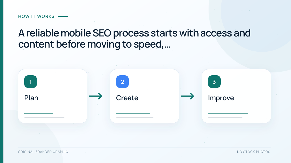
Effective mobile optimization follows a practical order: make the page accessible, preserve its meaning, improve performance, remove interaction problems, and then test the rendered result. Starting with cosmetic adjustments while mobile content is blocked wastes time.
1. Keep primary content equivalent across devices
Compare desktop and mobile versions of important page templates. The mobile page should include the same primary information needed to satisfy the search intent. For an ecommerce product page, that may include the product name, description, price, availability, specifications, reviews, images, and relevant links. For an article, it includes the complete main text, headings, author information, images, and contextual links.
Equivalent does not mean every decorative element must remain. You can simplify visual clutter and rearrange modules. The test is whether a mobile visitor—and Googlebot Smartphone—can access the information that makes the page useful and understandable.
2. Make mobile resources crawlable and renderable
Google needs access to the files required to render the page. Review robots.txt rules before blocking CSS, JavaScript, image folders, or content endpoints. A resource that looks unimportant in a file path may control navigation or load the main content.
Be especially careful with content that appears only after interaction. Google does not click a “load more” button, type into a field, or swipe a carousel to reveal primary information. Lazy loading is appropriate for non-critical content when it loads as the item approaches the viewport, but it should not depend on a user action that a crawler will not perform.
3. Use the viewport correctly
A responsive page normally includes a viewport declaration that tells browsers how to size and scale the layout:
<meta name="viewport" content="width=device-width, initial-scale=1">The viewport tag does not fix a non-responsive layout by itself. CSS still needs flexible widths, sensible breakpoints, and media that can shrink within its container. Avoid fixed-width elements that force horizontal scrolling, and test long words, code samples, tables, embeds, and cookie notices—not just ordinary paragraphs.
4. Preserve titles, descriptions, headings, and robots directives
Mobile and desktop versions should communicate the same page topic. Keep equivalent title elements, meta descriptions, clear headings, canonical signals, and robots directives. Accidental differences are particularly risky on dynamic or separate-URL configurations.
Do not remove descriptive headings simply to shorten a mobile layout. Use spacing, collapsible sections, or a more compact design instead. Clear headings help visitors scan a long page and help search systems understand its structure.
5. Preserve structured data
If a desktop page includes eligible structured data, ensure the mobile version includes equivalent markup and correct URLs. This is especially important when a mobile template is maintained separately. Validate the rendered mobile output rather than assuming a shared plugin produces identical markup everywhere.
Structured data must describe visible page content. Do not retain markup for a product, review, video, or FAQ that mobile visitors cannot actually find on the page. If you are new to the subject, start with the beginner’s guide to schema markup.
6. Improve mobile loading performance
Mobile connections and devices vary widely, so performance work should reduce unnecessary data and main-thread effort rather than target one premium phone. Common opportunities include:
- Compressing and appropriately sizing images.
- Using modern image formats where the publishing platform supports them.
- Serving responsive image variants instead of sending one oversized file to every screen.
- Removing or delaying non-essential JavaScript.
- Reducing render-blocking resources.
- Using effective browser caching and a capable hosting setup.
- Loading fonts carefully and limiting unnecessary font variants.
- Reserving dimensions for images, advertisements, and embeds to reduce layout shifts.
Use the site’s Core Web Vitals data to understand loading performance, interaction responsiveness, and visual stability. Laboratory tests help diagnose a page, while field data shows how real Chrome users experienced groups of pages over time. Both are useful, but they answer different questions.
7. Optimize images and video for mobile
Images should be sharp enough to be useful without forcing mobile visitors to download unnecessarily large files. Use descriptive alternative text when an image conveys information, retain useful captions, and avoid unstable image URLs that change on every request. The mobile version should not replace important desktop visuals with low-quality or context-free alternatives.
For video, use supported formats, keep the primary video easy to find, and avoid hiding it behind interactions that prevent discovery. A responsive player should remain within the screen at common widths. More detailed image guidance is available in the image SEO best practices guide.
8. Make navigation and internal links usable
A compact menu is acceptable, but it should still expose important destinations through crawlable links. Do not remove a valuable category or guide from mobile navigation solely because there is less screen space. Simplify the hierarchy and labels instead.
Within the content, link descriptive phrases rather than vague text such as “click here.” Leave enough space between interactive elements so people can select the intended link without zooming. Sticky bars should not cover navigation, headings, form buttons, or browser controls.
9. Design for reading and interaction
Good mobile typography uses readable text, comfortable line spacing, and sufficient contrast. Paragraphs should not span edge to edge, but excessive padding can make the content column uncomfortably narrow. Forms need visible labels, appropriate input types, clear validation, and error messages that remain near the affected field.
Test tasks, not just screenshots. Can a visitor open the menu, compare options, select a product variation, complete a form, dismiss a notice, play a video, and reach the next relevant page? A page may look correct at rest and still fail during interaction.
10. Control ads, pop-ups, and interstitials
Monetization and lead generation should not make the main content difficult to reach. Avoid overlays that occupy most of a small screen, advertisements that push the answer far below the first view, and close controls that are obscured or difficult to select.
Necessary notices, such as consent or age verification, should be implemented as clearly and efficiently as possible. Review them across multiple screen sizes because a banner that appears modest on desktop may dominate a phone.
How to Test Mobile SEO
No single tool can certify that a page has “passed mobile SEO.” Combine automated evidence with rendered-page inspection and real use.
Use Google Search Console
The URL Inspection tool can show whether Google indexed a URL, which canonical it selected, and whether the page is available to Google. A live test can help you inspect the current rendered version when troubleshooting. Look at the rendered HTML and screenshot where available, then confirm that primary copy, links, metadata, and resources are present.
The Core Web Vitals report groups URLs using field data. It is useful for finding template-level patterns, but changes may take time to appear because field data reflects real visits over a rolling period. The Google Search Console guide explains how to interpret its major reports without treating every status as an emergency.
Use PageSpeed Insights and Lighthouse
PageSpeed Insights combines available field data with a controlled Lighthouse test. Use the diagnostics to form hypotheses, not as a checklist where every suggestion has equal business value. A large hero image may be a high-priority fix; a small saving on a script below the fold may not be.
Lighthouse can also identify accessibility and implementation issues that affect mobile use. Retest under consistent conditions after making a change, and compare page templates rather than relying on a single homepage result.
Inspect responsive layouts in browser developer tools
Device emulation is useful for quickly checking breakpoints, overflow, navigation, and content order. Test several widths instead of one named phone model. Dragging gradually between widths often exposes awkward ranges that fixed presets miss.
Emulation is still an approximation. It does not fully reproduce a physical device’s processor, browser interface, touch behavior, network, keyboard, or accessibility settings.
Test on real devices and slower conditions
At minimum, test representative pages on a real phone. Use both portrait and landscape orientations. Try navigation, forms, filters, accordions, tables, embedded media, cookie controls, and checkout or conversion steps.
Include a constrained network or mid-range device in the process when possible. A site that feels instant on office Wi-Fi and a flagship phone may behave very differently for many visitors.
Compare rendered content, not only source code
Modern pages often assemble content with JavaScript, so “view source” may not show the final DOM. Compare what is rendered for mobile with what users and crawlers need. Search the rendered HTML for a distinctive sentence, important internal link, product field, or structured-data block.
This check is especially valuable after changes to lazy loading, client-side rendering, consent tools, personalization, or a mobile menu.
A Practical Mobile SEO Audit Workflow
Use the following workflow for a new audit or after a major template change:
- Choose representative URLs. Include the homepage and examples of articles, categories, products, services, forms, and any other important template.
- Identify the configuration. Confirm whether the site uses responsive design, dynamic serving, or separate mobile URLs.
- Check access and indexability. Review status codes, robots.txt, robots meta directives, canonicals, and required resources.
- Compare content. Verify that primary text, headings, links, images, video, metadata, and structured data remain equivalent on mobile.
- Inspect the rendered page. Use URL Inspection and browser tools to find hidden, missing, or interaction-dependent content.
- Review performance evidence. Combine field data, Lighthouse diagnostics, and waterfall or developer-tool observations.
- Complete key tasks on real devices. Test navigation, search, forms, filters, purchase flows, and notices.
- Group issues by template and cause. Fixing one shared component can improve hundreds of URLs.
- Prioritize by impact and confidence. Address blocked content, indexing conflicts, broken tasks, and major performance bottlenecks before minor cosmetic warnings.
- Validate and monitor. Retest the changed template, watch Search Console and analytics, and check that the fix did not create a desktop regression.
Document the evidence beside each recommendation. “The mobile page is bad” is not actionable. “The product description is absent from the rendered mobile DOM on every product template” gives developers a reproducible problem and a clear success condition.
Common Mobile SEO Mistakes
Removing content to make the page shorter
Mobile layouts should be focused, but deleting useful content can weaken the page. Reorganize, summarize supporting interface copy, or use accessible accordions while retaining the information required to satisfy the query.
Assuming responsive means optimized
A theme can adapt to screen width and still ship oversized media, unstable ads, slow scripts, or unusable menus. Test the complete experience rather than stopping when the layout stacks into one column.
Blocking scripts, styles, or images
Blocking resources may prevent Google from rendering the page as intended. Review the actual role of a directory before adding a broad robots.txt rule.
Lazy-loading content only after a click or swipe
Google Search does not interact with the page like a visitor. Primary content and links should become available without requiring actions that the crawler will not perform.
Serving different robots directives or canonicals
A mobile-only noindex, incorrect canonical, or inconsistent redirect can create serious indexing problems. This risk is higher when desktop and mobile templates are maintained separately.
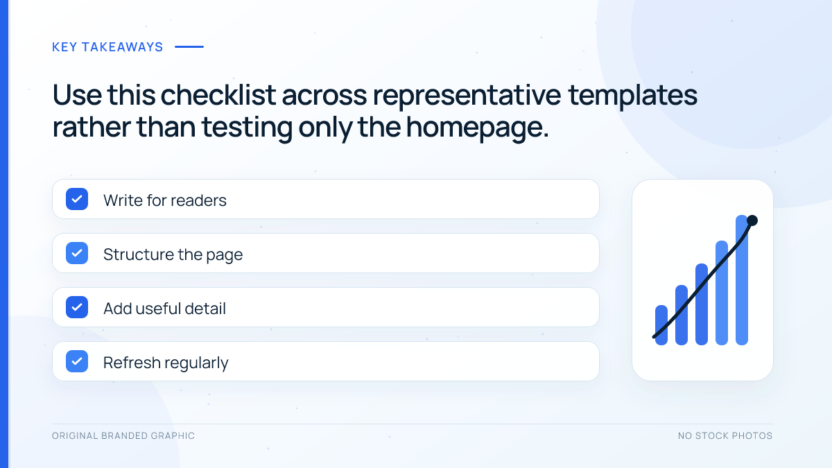
Optimizing only the homepage
Search visitors often land on articles, product pages, service pages, and categories. Test each important template and prioritize those connected to organic traffic and conversions.
Chasing a perfect performance score
Performance tools provide valuable diagnostics, but the score is not the business goal. Focus on changes that improve real loading, responsiveness, stability, and task completion without damaging content or functionality.
Ignoring overlays and third-party tools
Chat widgets, consent banners, advertisements, analytics, testing platforms, and lead forms can change the mobile experience after the main site code loads. Include them in testing and recheck pages when vendors update their scripts.
Mobile SEO Best Practices Checklist
- Use responsive web design for new builds unless a clear requirement supports another configuration.
- Keep primary content, headings, metadata, structured data, and internal links equivalent across devices.
- Allow Googlebot to access the resources needed to render the mobile page.
- Do not require clicks, swipes, or typing to load primary content.
- Use a correct viewport declaration and flexible layouts.
- Prevent horizontal overflow in tables, code blocks, embeds, and banners.
- Optimize images for appropriate dimensions, quality, format, and alternative text.
- Measure Core Web Vitals with field data and diagnose pages with laboratory tools.
- Keep navigation clear, crawlable, and comfortable to use by touch.
- Make forms, filters, search, media, and conversion flows usable on real phones.
- Avoid intrusive overlays and ads that obscure the main content.
- Inspect representative templates in Search Console after meaningful changes.
- Prioritize shared template issues before one-off page adjustments.
- Monitor organic traffic, indexing, engagement, and conversions after deployment.
Frequently Asked Questions
Does mobile SEO require a separate mobile website?
No. Most websites should use responsive web design, which serves the same URL and HTML while adapting the layout with CSS. A separate mobile site can work, but it requires extra redirect, canonical, alternate, metadata, and content-parity management. Responsive design is usually simpler to maintain and is Google’s recommended pattern.
Can content be hidden inside accordions on mobile?
Yes, accordions can make long mobile pages easier to scan. The important content should still exist in the rendered page and become available without a separate navigation request or inaccessible script. Use clear labels, keyboard-accessible controls, and descriptive headings. An accordion should reorganize content, not remove information from the mobile version.
Is mobile-friendliness a direct Google ranking factor?
It is more accurate to think in terms of multiple systems and outcomes than one pass-or-fail mobile factor. Google uses the mobile version for indexing, Core Web Vitals are used by ranking systems, and overall page experience can contribute to search success. Relevance and content quality remain essential, so a mobile improvement cannot guarantee a ranking increase.
How often should a mobile SEO audit be performed?
Run a focused check after a redesign, theme update, navigation change, consent-tool change, major plugin release, or template migration. For a stable site, review Search Console and performance data regularly and complete a broader audit periodically. The appropriate frequency depends on publishing volume, development activity, traffic, and business risk.
Why does a page work on my phone but fail Google’s rendered test?
Your browser may have cached files, stored consent, a faster connection, or access to resources that Googlebot cannot retrieve. Content may also depend on clicking, scrolling, personalization, or unsupported rendering behavior. Compare the rendered HTML, review blocked resources and server logs, and test the exact URL without assuming one successful phone visit proves crawlability.
Should mobile and desktop pages have identical word counts?
Not necessarily. Navigation labels, interface text, and presentation can differ, but the primary information and meaning should remain equivalent. If the mobile version removes sections that help the page satisfy search intent, Google has less information to index and visitors receive a weaker resource. Judge parity by usefulness and completeness, not a mechanical word-count match.
Conclusion
Mobile SEO is the discipline of ensuring that the version people use on phones is also complete, accessible, understandable, and efficient for search engines. The strongest approach begins with content parity and crawlability, then improves responsive layout, performance, navigation, media, and interaction.
Do not reduce mobile optimization to one score or device preview. Test representative templates, inspect the rendered page, complete real tasks on real phones, and use Search Console and field data to confirm what is happening at scale. When mobile content and usability are treated as part of the same system, mobile SEO becomes a durable foundation for both organic visibility and a better website.