To test fresh Pinterest Pin designs for website traffic, hold the destination page and audience intent steady, create meaningfully different original visuals, publish them at a manageable pace, and compare outbound clicks and engaged website visits over a consistent observation window. A fresh creative test is useful only when the Pins honestly represent the linked page and the results inform your next design decision.
Quick Answer
Start with one useful article, two or three distinct visual approaches, a simple tracking sheet, and a verified website destination. Give each Pin a descriptive title, readable creative, and a link to the same relevant article. Record publication dates and Pinterest outbound clicks; inspect Pinterest referral sessions in GA4 where tracking permits. Compare patterns rather than declaring a winner from a handful of impressions. This tutorial shows how to test Pinterest Pin designs without confusing design performance with topic demand.
Key Takeaways
- Change the visual concept, not the promise or destination, when testing creative approaches.
- Use original designs with legible text and truthful previews of the linked content.
- Separate impressions, saves, outbound clicks, and website engagement in your reporting.
- Document dates and distribution differences; organic tests cannot guarantee equal exposure.
- Keep a winning design principle, then test a new angle rather than repeatedly reposting near-identical Pins.
What a useful Pin creative test actually measures
Pinterest users discover ideas through search, recommendations, and boards. A Pin can be displayed many times without sending someone to your website. Creative testing asks whether a particular presentation helps the right person recognize the value of a linked page and decide to visit it. The important distinction is between an attractive image and an accurate invitation to useful content.
An organic test is not a controlled laboratory experiment. Pinterest may distribute different Pins to different audiences and at different times. A newer Pin may have fewer opportunities to earn clicks. Record these limitations instead of treating a higher click rate as proof that one font or layout caused the difference.
For broader planning, first follow a first-month Pinterest SEO workflow. That guide covers foundational account and content planning; here the narrower job is evaluating visual treatments for a single existing article.
Prepare one destination and one reader promise
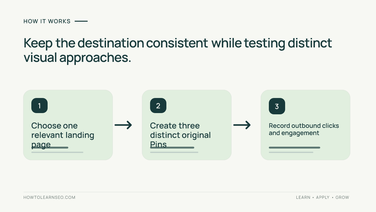
Choose an article that solves a specific problem, such as a tutorial about identifying keyword intent. Check that its page loads on mobile, contains the promised instructions, and offers a useful next step. A Pin promising a downloadable worksheet must lead to a page that actually provides it. If the article is vague, improve the destination before testing graphics; otherwise even a compelling design can attract disappointed visitors.
Write one sentence describing the visitor’s job: “I want a practical checklist for checking whether my Pinterest Pin matches its landing page.” Use that as the common promise for all variants. Do not test a generic “Grow traffic fast” message against a specific audit checklist and then attribute every difference to visual design: those headlines attract different intent.
Use the Pin-to-landing-page relevance audit to check headline alignment, visual promises, page usefulness, and mobile usability. Fix broken links, mismatched previews, intrusive overlays, or missing examples before the first Pin goes live.
Build three genuinely different original creatives
Design three vertical graphics for the same destination. A 2:3 layout is a practical starting format for standard Pins, but verify current requirements in Pinterest’s official business guidance before producing a large batch. Keep essential words comfortably away from edges and preview the images at phone size. Avoid relying on tiny labels that are readable only in a full-size editor.
Variant A can be a straightforward instructional cover: a large “Pin Landing Page Audit” headline, a short checklist subtitle, and one simple icon. Variant B can show a miniature process diagram with three clearly labeled stages: promise, page, verification. Variant C can use a before-and-after comparison, contrasting a misleading generic promise with a precise helpful promise. These are different information designs, not three recolors of the same template.
Keep branding consistent enough for recognition: a restrained palette, small website identifier, and comparable typography quality. Make the difference the composition or explanation, not an accidental contrast between polished and unreadable artwork. Original does not require complex illustration; a clear, honest diagram often teaches more than decorative stock imagery.
Write a short creative brief for each variant before opening your design tool. Include the primary message, visual hierarchy, destination URL, intended reader, and one reason this presentation might help. Keep the Pin title and description relevant to the same article. For a focused treatment of metadata, see writing Pinterest Pin titles and descriptions.
Publish carefully and document the conditions
Use a Pinterest Business account and an appropriate, relevant board. Publish the variants over a realistic period rather than flooding the same board with near-identical Pins in minutes. Do not assume a particular daily cadence guarantees distribution. If you schedule posts, document the scheduled and actual publication dates so later comparisons remain interpretable.
For each Pin, capture its URL, creative label, board, title, description, landing page, publication date, and measurement date. If the platform shows impressions, saves, Pin clicks, and outbound clicks, record them separately. Pinterest metric definitions and reporting windows can change; consult the Pinterest Analytics documentation for current definitions and availability.
A simple sheet is enough: one row per Pin, columns for the fields above, and notes about unusual circumstances. If a Pin was published during a seasonal spike or was promoted elsewhere, mark that explicitly. Do not mix paid and organic results when the goal is to learn from organic distribution.
Measure visits, not just visibility
Impressions describe exposure; saves may suggest future interest; outbound clicks indicate an attempt to leave Pinterest for the linked destination. Those are different actions. For a website traffic objective, prioritize outbound clicks and what visitors do after arriving, while using impressions as context for whether each creative had a fair opportunity to be seen.
In GA4, inspect the relevant landing page and traffic source dimensions for Pinterest referrals, while remembering that attribution, consent choices, redirects, and tracking configuration can affect reported totals. A UTM-tagged destination can help distinguish campaign links, but it does not make analytics perfectly complete. For a dedicated setup walkthrough, use tracking Pinterest traffic in GA4 with UTM tags.
Do not treat Pinterest outbound clicks and GA4 sessions as identical counts. They are produced by different measurement systems and can differ for legitimate reasons. Compare direction and quality over a sensible window, and investigate large discrepancies before announcing that a design improved traffic.
If available and configured correctly, inspect engagement rate, key events, or useful on-page actions for the specific landing page. An image that attracts many curiosity clicks but leads to immediate exits may be less valuable than a quieter design that draws visitors seeking the tutorial.
Worked example: choose a next design without inventing certainty
Imagine a website has an article teaching readers to audit Pin-to-page relevance. Its owner publishes the three concepts described earlier: A is a plain checklist cover, B is a process diagram, and C is a before-and-after comparison. The owner records each Pin’s date and board, checks that all links reach the same page, and reviews the results after each has had a reasonable observation period.
Suppose the illustrative sheet shows A with 1,000 impressions and 12 outbound clicks, B with 600 impressions and 15 outbound clicks, and C with 200 impressions and 2 outbound clicks. These numbers are fictional teaching inputs, not results from a real account. The arithmetic gives outbound-click-per-impression ratios of 1.2%, 2.5%, and 1.0%, respectively. B appears promising, but it had fewer impressions and may have reached a different audience.
The correct next action is not to proclaim that diagrams always win. Check whether B’s visitors engaged with the article, whether its distribution came from the same kind of board, and whether the measurement windows are comparable. Then create a new diagram variant that tests a different information hierarchy, while retaining a clear, truthful destination promise.
For an edge case, imagine C received only a handful of impressions. Its low click count says little about the concept because exposure was too limited. Mark it inconclusive and wait or test the concept on another appropriate article. Do not repeatedly republish the identical image simply to force distribution.
Interpret results with a decision framework
- High impressions, few outbound clicks: review whether the headline, visual hierarchy, and promised benefit are specific and understandable.
- Low impressions, some qualified clicks: keep the concept in consideration; distribution may be the limiting factor.
- Many outbound clicks, poor on-site engagement: audit whether the creative overpromises or the landing page disappoints.
- Healthy visits and engagement: preserve the underlying design principle and test it on a related article.
- Insufficient observations or unequal conditions: label the comparison inconclusive instead of manufacturing a winner.
The framework is diagnostic, not a set of universal benchmark thresholds. Your website, niche, audience, season, and article intent determine what constitutes useful performance. Compare against your own relevant history when enough data exists, and document why a design was retained or revised.
Common mistakes that make creative tests misleading
Changing the destination article, Pin promise, board, posting time, and image simultaneously makes interpretation difficult. It may still be a worthwhile editorial experiment, but it is not a clean comparison of visual treatments. Choose one principal question per round and keep the rest as consistent as practical.
Another mistake is treating saves as visits. Someone may save a useful diagram for later without opening the website. Likewise, a high number of impressions does not establish that visitors found the linked content valuable. A third mistake is selecting a winner after one day even though different Pins have had different distribution opportunities.
Avoid clickbait, misleading “secret trick” language, unauthorized imagery, repetitive near-duplicate uploads, and destinations unrelated to the Pin. Pinterest’s community guidelines are the appropriate reference for policy boundaries; creative quality is not an excuse to bypass them.
Turn a test into a repeatable editorial workflow
Keep a compact creative library containing each Pin’s image, title, link, test hypothesis, observation dates, and decision. After each round, record one lesson that can be used on the next article: perhaps process diagrams made complex steps clearer, or a concise checklist better matched beginner search intent. Avoid turning one isolated observation into a rule for every topic.
Plan future content with the reader journey in mind. A well-structured board can organize related articles, but it cannot compensate for weak destinations. See planning Pinterest boards for relevant website visitors when deciding how new creatives fit your topic clusters.
A useful Pin-ready hook for this tutorial is: “Three Pin designs, one landing page: which brings visitors who actually read?” Two other angles are “Stop judging Pins by impressions alone” and “A simple creative-test sheet for website owners.” Each points to the same practical lesson without promising viral results.
Set a review routine you can maintain. After collecting enough observations to identify a credible pattern, choose one adjustment and document the next test. If the platform changes its reporting interface, update your measurement notes instead of pretending an older workflow still applies. The purpose is cumulative learning, not a constant race to publish more images.
Frequently Asked Questions
How many Pinterest Pin designs should I test for one article?
Two or three meaningfully different designs are a manageable starting point. The right number depends on your capacity to create original graphics and review the results carefully.
Should all test Pins link to the same page?
Yes, when the goal is to compare creative treatments for one reader task. Keep the landing page and core promise consistent so destination differences do not dominate the results.
Is a higher impression count proof that a Pin design is better?
No. Impressions show distribution, not qualified website visits. Review outbound clicks, observation periods, audience differences, and relevant on-site engagement before drawing conclusions.
Can I use the same Pinterest Pin description for every variant?
You can preserve the same core intent, but write natural, accurate descriptions suited to each creative. Avoid mechanical repetition and misleading wording simply to create artificial differences.
Why do Pinterest outbound clicks and GA4 sessions differ?
The platforms count different events and may apply different attribution, consent, and filtering rules. Verify destination links and tracking before interpreting a discrepancy as a creative problem.
How long should I wait before choosing a winning design?
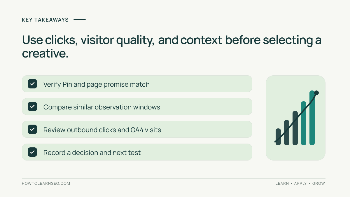
There is no universal waiting period. Compare similar observation windows, consider how much exposure each Pin received, and label low-data outcomes inconclusive rather than forcing a decision.
Conclusion
Testing fresh Pinterest Pin designs for website traffic is most useful when every creative makes a truthful promise, leads to a helpful page, and is evaluated with the right metrics. Start with a small set of distinct designs, track publication conditions, compare outbound clicks alongside on-site behavior, and keep uncertainty visible. The result is a repeatable method for improving how readers discover your website—not a claim that any one template will automatically produce traffic.